Appearance
Button
常用的操作按钮。
效果预览
基础用法
点击查看源码
html
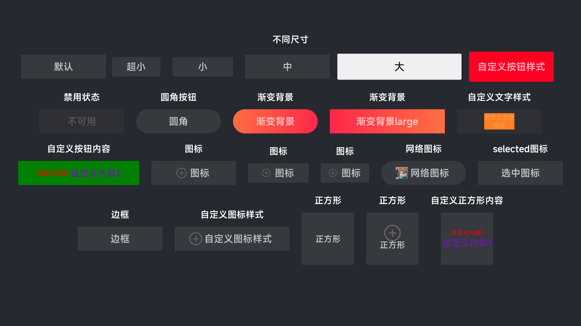
<qt-button text="默认"></qt-button>不同尺寸
点击查看源码
html
<qt-button size="mini" class="text-button-class" text="超小"></qt-button>
<qt-button size="small" class="text-button-class" text="小"></qt-button>
<qt-button size="medium" class="text-button-class" text="中"></qt-button>
<qt-button size="large" class="text-button-class" text="大"></qt-button>
自定义按钮样式
点击查看源码
html
<qt-button
        class="text-button-class"
        text="自定义按钮样式"
        :style="{backgroundColor: '#FF0022', height: '100px'}">
</qt-button>
禁用状态
点击查看源码
html
<qt-button disabled text="不可用"></qt-button>圆角按钮
点击查看源码
html
<qt-button round text="圆角" class="text-button-class"></qt-button>正方形
点击查看源码
html
<qt-button square text="正方形" class="text-button-class"></qt-button>渐变背景
点击查看源码
html
<qt-button
        size="medium" class="text-button-class" round
        text="渐变背景"
        :gradientFocusBackground="{colors:['#10F5F5','#AA79F0'], cornerRadius: 100, orientation: 3}"
        :gradient-background="{colors:['#FF2648','#FF6F44'], cornerRadius: 100 ,orientation: 3}">
</qt-button>
自定义文字样式
点击查看源码
html
<qt-button size="medium" disabled
           text="自定义文字样式"
           :text-style="{width:'100px', backgroundColor:'#FF8022', fontSize: '20px'}"
           class="text-button-class"></qt-button>
自定义按钮内容
点击查看源码
html
<qt-button style="width: 400px;background-color: green; margin: 20px">
    <qt-row>
        <span style="font-size: 20px; color: red">自定义内容1</span>
        <span style="font-size: 30px; color: #7415B1">自定义内容1</span>
    </qt-row>
</qt-button>
资源图标
点击查看源码
html
<qt-button size="medium" text="图标"
           :icon="require('../../../src/assets/add-circle.png')"
           :focusIcon="require('../../../src/assets/ashbin.png')"
           class="text-button-class">
</qt-button>
网络图标
点击查看源码
html
<qt-button size="medium" text="网络图标" round
           icon="https://qcloudimg-moss.cp47.ott.cibntv.net/channelzero_image/2023/03/30/78dbb25b-772e-4355-8e34-97d72c1d6954.png"
           focusIcon="https://qcloudimg-moss.cp47.ott.cibntv.net/channelzero_image/2023/03/28/cc7ab76f-c813-4cf0-a671-b0c111e7a52f.png"
           class="text-button-class">
</qt-button>
边框
点击查看源码
html
<qt-button :focus-border="true"
           size="medium" text="边框"
           class="text-button-class">
</qt-button>
自定义图标样式
点击查看源码
html
<qt-button size="large" text="自定义图标样式"
           :icon-style="{width: '50px', height: '50px'}"
           :focus-icon-style="{backgroundColor: '#FF9933', width: '20px', height: '20px'}"
           :icon="require('../../../src/assets/add-circle.png')"
           :focusIcon="require('../../../src/assets/ashbin.png')"
           class="text-button-class">
</qt-button>
属性
| 参数 | 说明 | 类型 | 可选值 | 默认值 |
|---|---|---|---|---|
| size | 尺寸 | string | large medium small mini | medium |
| disabled | 是否禁用状态 | boolean | — | false |
| circle | 是否圆形按钮 | boolean | — | false |
| round | 是否圆角按钮 | boolean | — | false |
| square | 是否正方形按钮 | boolean | — | false |
| buttonStyle | 按钮的样式 | object | — | null |
| textStyle | 按钮文字的样式 | object | — | null |
| iconStyle | 按钮图标的样式 | object | — | null |
| focusIconStyle | 按钮图标焦点状态的样式 | object | — | null |
| gradientBackground | 渐变背景 | object | — | null |
| gradientBackground | 焦点状态渐变背景 | object | — | null |
| enableFlexStyle | 是否启用FlexStyle(只在qt-list-view或者qt-gird-view生效) | boolean | — | false |
| text | 按钮文字 | string | — | `` |
| icon | 按钮图标 | string | — | null |
| focusIcon | 焦点状态按钮图标 | string | — | null |
| focusable | 是否可以获得焦点 | boolean | — | true |
| focusScale | 焦点放大倍数 | number | — | 1.08 |
| focusBorder | 焦点状态是否显示边框 | boolean | — | false |